Lucy Coggle
I’m a better talker
13 January – 7 February 2009
The contradiction of I’m a better talker, is that in spite of this boast, the patter of the exhbition is exceptionally stupid, banal and repetitive (in order R-L from the door): there is a half-hearted nonsense definition, the inspid assurance ‘friendly’ cascading to the floor, and the inoffensive expletive ‘bugger’ built up to an epic landscape. Even discounting writers and comparing this solely with the work of other artists, it seems hard to identify the function of language as we see it operating here: we are not offered the vernacular of Richard Prince, the narrative of Sean Landers, the verbosity Raymond Pettibon, the precision of Ed Ruscha, or still less the polemic of Barbara Kruger. Instead, I’m a better talker seems pointedly to set image and text at odds: what it is saying and what it is doing are in constant contradiction, and like the duck-rabbit of the original master of language games, Wittgenstein, the work seems to flicker back and forth between its two states.
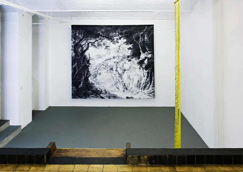
Working on an engulfing scale, the artist has taken a small ink sketch by Constable, blown it up to a theatrical backdrop, and obsessively re-worked it with hundreds of thousands of ‘buggers’. This is a bathetic puncturing of pastoral escapism; confronted with this vista, we are presented with the illusion of our possible sublimation into this pre-lapsarian fantasy, whilst simultaneously aware of its dystopic souring. The way it has been drawn means it is both imposingly grand and risibly idiotic: as we approach, the majestic promise of the landscape disintegrates into the gleeful stupdity of mundane repetition. The signature-like scrawl of ‘bugger’ and the actual inclusion of Constable’s signature (left foreground) lead us to ideas of authenticity, and of cultural inheritance – just like the gentrified swear-word ‘bugger’, this rendition of the English Arcadia is a tame and domesticated version of a potentially chaotic fantasy.
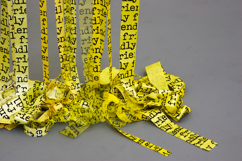
Language once again disintegrates in Catastrophic Success. The combination of yellow and black implies a warning of danger, and yet the language insists on its ‘friendly’ intentions to the point of inanity. The yellow ribbons recall the old custom of remembrance – ‘tie a yellow ribbon round the old oak tree’ – and yet this affable and personal tradition has recently been entirely co-opted into the ‘Support the Troops’ propaganda. Its oxymoronic title comes from a 2004 statement in which Bush declared the initial stages of the war in Iraq to be a ‘castrophic success’. Similarly, the double speak of ‘friendly’ fire, the doubling up of pairs of inverted ribbons, all imply that language is far more defined by use and context – that perhaps appearance and insistence are all. As they hit the floor, the ribbons fall apart, the potential response to a moment in politics collapses in a heap of ink, silk, and cotton.
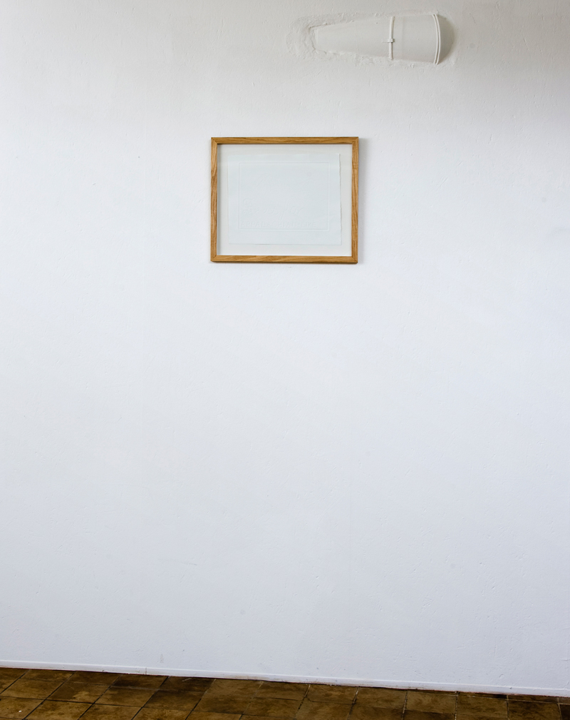
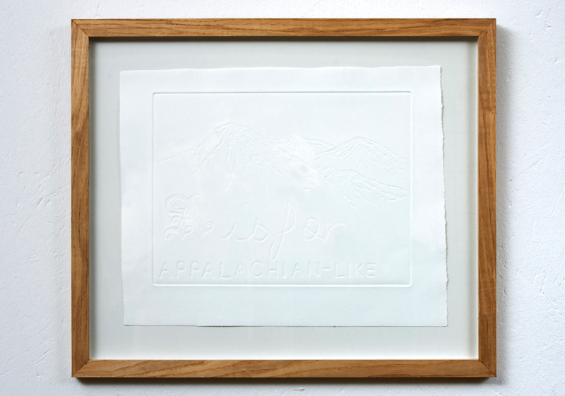
This primacy of the physical over the verbal is also at play in Untitled (A is for). In spite of its straightforward, declamatory structure, there is approximation and prevarication in what it claims. ‘A isfor…’ – it is a substitute, a version, an imitation, or a reference to another, and thus without automous substance in itself. Indeed, literally, as you step back, the embossing disappears and it becomes an insubstantial blank sheet of paper again, its definition erased. The form itself – the way we teach a child the alphabet, the beginnings of words, with constant reference to things – assumes a language defined by the objects it names. It predicates the visual and physical reality as primary, with language descended from it. However, the clumsiness of the text here, its bulky ‘Apalachian-like’, refuses this demotion, and instead dominates the very sketchy drawing of mountains behind.
Throughout I’m a better talker, the text is literally embedded, undermining the images it makes up. It is never a comment on, or a definition of something other, but rather, it becomes the work.